accessibility
10 Best Tips to Improve Website User Experience
New year, futuristic technologies, and unseen challenges.
After living through a typical pandemic-prone 2 years, 2022 will be a distinct challenge in improving website user experience.
Disruptive technology and unexpected time require us to embrace the change proactively.
As we know, competing to the unexpected is a bit challenging in an economy that wants us to survive and thrive altogether.
Websites are the face of your business, and innovation attached to web interfaces is evolving faster than ever. It is because we need to improve our customers’ digital experiences and connect them with the things they are looking for.
How can technology help you improve the website user experience in 2022?
Your website is the digital salesman that brings your customers, 24/7 and therefore must be a centerpiece to your marketing efforts.
Prioritizing web user experience(UX) is like giving out the best impression of your business.
What is user experience(UX)?
The best user experience is the gist of the product design and that can be a website, a mobile app, or any digital interface.
Most people mix UX with several misconceptions when it comes to product design. But in reality UX design reciprocates with your target audience leading you to prosperity and growth.
What is UX Design?
User Experience Design (UX Design) plays a major role in grabbing users’ attention and increasing their satisfaction level by improved usability, accessibility and efficiency of customer engagement on websites and mobile apps.
UX design focuses on enhancing the user experience of using your product. The product design takes it to go beyond the physical essence of the product by adding business story and content creation you make for the awareness of your product. The real point is that UX design transforms your digital stores more seamless and frictionless.

How to improve website user experience design?
Let’s take a look at the user experience improvement tips you can incorporate in your designs today.
1. It begins with user research
Before you kick start, it is necessary to know the impact your product is going to make on your audience. You can know the impact of your audience by knowing the needs and demands of your target audience. Therefore no question matters more than “who is it for?” and “how its gonna help?”
Knowing the behavior of your audience is very much essential. After surviving through pandemic-prone years, almost every business entrepreneur knows the importance of in-depth research on user behavior, their desires and building a marketing strategy that answers those needs.
After this you need to jot down to build a product design strategy that meets the users’ requirements.
Does the product design help accessibility of your product? How you can improve the product design to take the competition to the next level?
(Hint: The serious competitive advantage is offering the more improved website user experience.)
Its not difficult as it seems with the help of AI and automation-based tools that drill down the right information helping you build the best product design and marketing strategy.
Key takeaway: Use automation audio plugins to improve the website user experience by making product information more accessible.
Remember: Its more a lot easier to engage a large audience by making your design more responsive and website accessible.
2. Simplicity—It clearly speaks on your brand image.
In order to improve the website user experience, simplicity means getting rid of unnecessary things on the website.
It also means putting out all products in a way that is more reachable, and easily accessible.
Important Note: The goal is to make your users to take action when they are coming to your website. Therefore it is necessary to reduce their efforts. Modern technology and business techniques emphasize on one-click strategy.
All products on your website should be accessible within a few clicks.
Key takeaways: Do you know why audio technology is going to be the next big hit in the business world?
Because audio technology is making access to all important things whether its the products, content or important information within one click.

Let’s see how simplicity and precision can improve website user experience.
- Each page of the website must have a single definite goal. For instance, the checkout page should contain information that requires only checking out. The checkout page usually contains the address form, checkout information form, and product shipment form.
- The website page design intent should be accessibility and reachability to the desired product within a few clicks. For Instance use prominent headers, anchor text, catchy CTA’s, and visually appealing navigation pathways that make your visitor to reach the product without doing extra effort.
- Why website updating is necessary from time to time? Website updates also means renewing old information with new statistics.
- Extra tip: you can add a timer that tells your visitor when the last time the specific page or blog was updated. It enhances their belief on the authenticity of the information and improves the website user experience.
3. White space is your digital friend—use it generously
Using white space is one of the seamless and frictionless ways to enhance the visibility of your website. Using it in a subtle way will allow your website to breathe a more polished look.
White space gives a more spacious look and gives you more edge to place your content in a more creative way.
The background of the website is not always white. You can choose white color as the space between the elements of your website.
Let’s look into some useful ways to use white space to enhance the UX of your website:
- Put your content in a way that looks spacious and perfectly aligns with the design and white space of the website.
- In order to increase the comprehension level up to 200%, use white space at the right and left margins.
- Place images that equate with the text and white space. Don’t overdo the content, images or add white spaces.
4. Make different elements audio-visually accessible
One of the most significant goals for UX designers is a visually distinct page layout. It is a way to retain a flexible user path and engage user experience.
We all know making the landing pages more visually significant. It’s one of the known methods to hook visitors’ attention and make them find things without any fuss.
What’s new? Making the website audio-visually accessible.
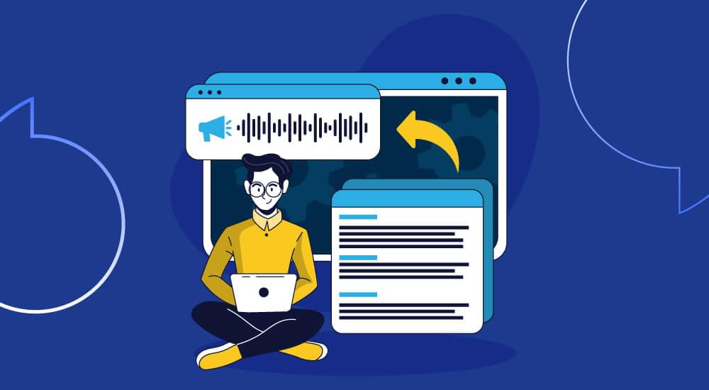
It means adding an audio plugin for your visitors to acquire voice assistance to find things that they are looking for.
Moreover, text-to-speech tools convert the text into the most human-like voice and hear out the important product information, business message, and blogs. It is necessary for people to reach your website when looking at a screen is not possible and a great help to people who are facing eyesight problems and scrolling through the website is not possible visually.
What’s more, is that your visitors can listen to your content in different languages. Businesses are competing for their products at the global market. Therefore, it is necessary to make your website as per the standards of the international market.
Here are a few useful tips that might play a significant role during the design process:
- The important business message and information on the website must stand out audio visually. Whether it’s a headline, a video, or a blog, it must be seen, read and heard out properly. Use proper captions and subtitles for your videos not only to increase their accessibility, and visibility and reachability at all search engines.
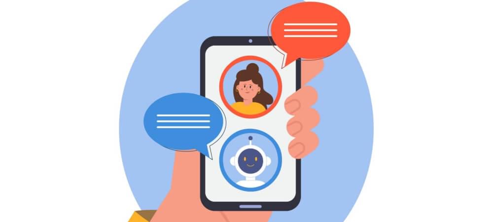
- Use voice assistance to navigate your users through the website. AI chatbots play useful role to enhance the accessibility of products on your website. During the lockdown, AI-based chatbots played important roles for virtual tours to showcase products since the physical stores were closed.
- CTAs (Call-to-action buttons) need to be prominent and placed in a way that delivers the right message and well explains the intent. For instance, add subscribing button at end of your email, or incorporate a QR code that directs users to a landing page for quick sign-ups.
- Contrast and Color: the enhanced text readability and eye-friendly designs are essential. The colors that speak out for your brand identity enhance the readability of the text.
5. Ask for Customer Feedback
Businesses thrive on the information of knowing what their customers want.
Therefore, listening closely to what your customer says, can take your business to the next level. If you don’t, you are losing the opportunity of survival in a pandemic ad endemic world.
Ask questions likewise:
- How we can enhance your experience?
- What features do you like the most and would like to see in the future?
- Do our products meet your expectations?
- Share your experiences
The business FAQs allow individuals to explain their experiences explicitly and let you know how you can improve website user experiences. The information you collect from the feedback of your users, stakeholders, and audience will help you evaluate your marketing strategy and make the best business decisions. For instance, if 50% of answers are about a problem finding a specific product on your website, then it means it is time to add a search button.
Listening to users’ feedback and their valuable inputs allows you to improve website user experience and enhance UX significantly.

6. Flow: Maintain Consistency of the User Flow Throughout the Journey
When it comes to design thinking, a seamless web flow is the ultimate goal to achieve an improved website user experience.
Here is why it matters: A seamless design framework enhances the online shopping experience, information acquiring process and improves website user experience.
Consistency and flow perpetuate implementation, engagement, and conversion rate.
With an in-depth process and thinking through the step-by-step process, you will be able to achieve the goal of making the web experience flawless.
Nowadays are automated and move automatically, and take them to the tour of all important things and business message they want to show.
Its a beautiful sliding and gliding experience into their journey of rolling out outstanding products without involving your effort.
Take your users to all important phases of product creation in a most alive and warm way. Start with simple beginning leading to transparent middle and make sure that ends on meaningful purpose. Because in the end of the day, make your users part of your journey so they would like to remember your brand if they don’t decide to buy for you immediately.
Eventually, a robust website flow help businessmen achieve their target.

7. Page Loading Time
Your website’s loading page speed is very much important. It shouldn’t take more than 3 seconds to load, 53 percent of people will leave your website.
Therefore don’t let your efforts go vain just because of this teeny tiny roadblock. The visitors who want to see the products delivered to them fast, also want the fast functionality of the website. The load time, waiting times, and smoothness of pop-up animation could affect the perception of users.
8. Focus on making content, a king of your website
The marketing endeavors are not limited to designing a robust website, it also includes we structured content.
Content is the king and the accessibility of content is its queen.
Use the language that your auidience understands well. Make it warm, alive, catchy and transparent.
In the end we are human beings and want to read good stories. So tell them good and lively business story.
Research on your audience age, culture and language so you know how to tell them a story that keeps them enagaged.
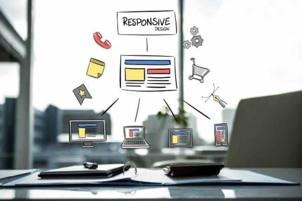
9. Make Your Website Responsive and Mobile-Friendly
More than half of audience comes from mobile devices. Therefore, making your website well responsive is not an options, its a necessity. Catching potential customers is essential by making your websites well responsive.
Google and other search engines crawl both your desktop and mobile websites and uses both of them to index your website. That means that, in terms of SEO, a mobile-friendly website can help you get more conversion.
10. Conduct a UX Review/Audit
Who doesn’t know the importance of quality assurance? Reviewing the website with the indepth insight and cross checking the goals are being achieved. Keep the audit process simple, and transparent so you can know the bottlenecks and bugs, so can remove them on time.

The technologies that can improve the user experience of website
Here are some of the tools and technologies you can use to improve the user experience of your websites and blogs.
1. PWAs are coming on top
Coming with 36% higher conversion rates, PWAs deliver mobile-like experiences through web applications.
Being more interactive and responsive, they revolutionize user experience in a form of making it more user-friendly and meaningful.
Big tech such as Amazon, Twitter, and Forbes are combining native and hybrid app technology to increase conversion and decrease bounce rates.
Not only it improves the website performance, speed and quality, it has capability to engage customers with a personalized experience.
With PWAs, you can design and build your customized websites in a way that improves digital shopping experience, and bring customers who will visit your website very often.
2. Chatbots are the future of engagement
AI-powered chatbots are not new, but emphasis on having these chatbots on type of website has become more inclusive than ever before.
Chatbots have been underrated as well. But in 2020, AI-bots actually helped to engage users, helping them find things and answering their questions in a more human-like way is not lackluster technology anymore.

3. Beautification of simplicity never fails to sell
We often make things more complex in order to make them more beautiful and eye-catching.
In 2020, it became a more frustrating phenomenon, as it didn’t serve the purpose of making the life of your users any easier. Such websites take more time to load, are difficult to navigate and increase the bounce rate.
We need to focus on making things simpler in a way that engages your audience and serve the real purpose of your website and business.
Moreover, the more complex the project is, the longer it will take to maintain.
Along with new technologies and versions coming up, it will be a freaking nightmare to maintain complex projects.
With the most widely used web frameworks and PWAs, you can build most beautiful UI interfaces that keep things simple and less abstracted.
4. APIs—the first in the future
The APIs empower connectivity, allow recycling of the code for multiple platforms and make it possible to add extra features seamlessly. It’s a good option to acquire data in a faster and reliable way. For instance, you can use Google Maps APIs to get the data instead of drawing the map on your own.
5. Using the right tool for the right problem
It’s not the technology that lacks a solution, but it’s mostly us who need to utilize the technology to get the specific solutions effortlessly. More often we jump on the bandwagon to use different technologies for different sorts of problems. Instead of jumping on everything, we should stick to the specialized use cases.
Niche technology is for niche problems.
For instance, using audio tools and audio plugins can give you multiple benefits both to your business and your web visitors.
Disruptive technology offers solutions in search of specific problems, and we can have very good solutions for these kinds of problems if we know what to use for what.
6. Taking an extra mile to meet more than what expected
The secret sauce is winning over your users’ expectations.
A great customer service formula is= Reality - Expectations.
You can be as perfect as it gets, but if your users were expecting more than you were able to deliver, it means you delivered the project successfully, but your customer services weren’t as perceived as great.
All you have to do is to do a little more homework to know your customers, what they want and what are their expectations.
Do you know? From enterprises to startups, all businesses are using audio technology to run their business operations, assist their clients and run their digital platforms.
7. Happy metrics come back with happy users
Not most of the people like surprises, especially the unpleasant ones.
You need some solid ground, in order to go beyond than expected.
How can you predict user behaviour?
Use algorithms and metrics to determine the identity and behaviors of your users.
Now you would know how to meet their expectations and deliver them what they are looking for.
FYI: Audio tools not only help to run important business operations but also lead to take best business decisions.
8. Data is the new oil
Using the smart technology in a smart way leads you to know your customer. Using the information insights to know your customer behaviour is the key.
Why knowing your customer is important? And how does it correlate with designing and building your website interface?
If you know who your customer is, what they want and depending on their search history can help you to lead them at the right place whenever they visit your website.
For instance, if you are looking for things for your kitchen. As your previous search history shows kitchen items, it will let you in the kitchen section instead of bathroom items section.
ML and AI-powered analytics can help you connect with your customers in more productive and meaningful ways.
it will help you set your catalog and web browsing algorithms in a way that reduces the gap between users and their search for the desired products and gives them a personalized experience.
Closing thoughts
The coexistence of merchandising, highly responsive websites, and search algorithms together is the real beauty that serves the meaningful experience to customers.
And a stellar website development company helps you achieve it altogether.


